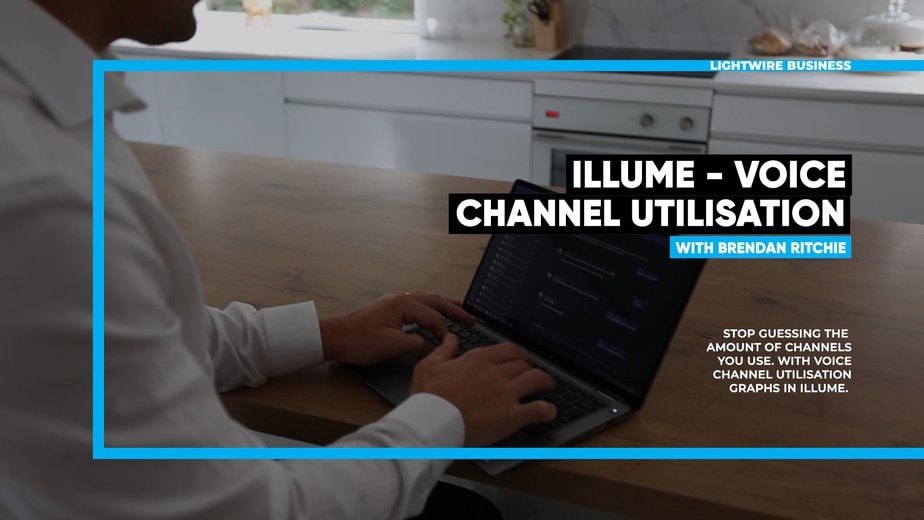
Know exactly how many simultaneous calls you’re making with the new Channel Utilisation graphs in illume – use objective data analysis to control costs and make informed decisions about upgrading/downgrading voice services.
Previously, the amount of calls being made has been a bit of a mystery with no indication to let you know if you have hit your limit or even if you’re getting close to it. With this new feature, you will be able to check channel usage on your account instantly.
The graphs show 3 lines:
- The red line which represents 100% utilization,
- The orange line which represents 75% utilization
- The blue line which shows the number of calls made over a 5-minute period which can be viewed both in a daily and monthly format.
Additionally, if you are on the 3CX service the graphs also include intra-3CX calls meaning it is very accurate across all service types.
This graph takes the guesswork out of managing your voice channel capacity and means you won’t be inadvertently turning away phone calls due to maxed out voice channels. It also means you won’t be overspending on unused channels.
This feature is only stage 1 of many more features to come which will include, alerting at predefined thresholds meaning that when your close to your limits you will receive proactive notifications to alert you of this as well as reporting. The reports will show a view of the month been and its utilization trends so you can adjust according to your company’s needs.
Stay tuned for more exciting features to come!